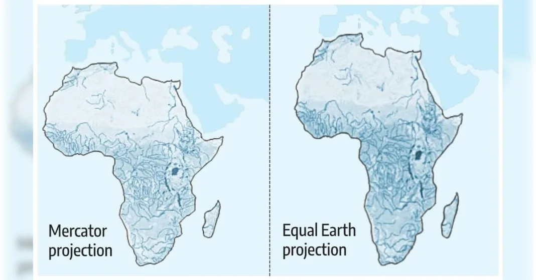

The United Nations General Assembly has adopted a resolution calling for world maps to more accurately reflect the relative size of Africa and other regions, over the objections of the US.
The US’ own role in trying to establish its own maps, points to the larger question: What is in a map?
The African Union (AU) has endorsed the ‘Correct the Map’ campaign to replace the Mercator map projection with alternatives such as the Equal Earth map.
At the heart of this demand is the charge that the Mercator projection, widely used in schools, media, and online platforms, systematically distorts the sizes of landmasses, shrinking Africa while inflating Europe, North America, and Greenland.
What’s the issue
The Mercator projection, in use since the 16th century, makes Africa look comparatively small while inflating the size of land masses further away from the equator. The African continent appears to be roughly as big as Greenland, though at 30.3 million sq kilometers it’s about 14 times as large.
How big is Africa really?
Africa is a giant among the world’s continents at about 30.3 mn sqkm.
> Large enough to contain the US, China, India and most of Europe, yet on a Mercator map it looks roughly the same size as Greenland, which is actually about 14 times smaller than the continent.
What is Equal Earth?
Equal Earth was launched in 2018 by three cartographers — Bojan Savric of the Environmental Systems Research Institute, Tom Patterson of the US National Park Service, and Bernhard Jenny of Monash University.
>It preserves the relative surface areas of continents and, as much as possible, shows their shapes as they appear on a globe.
Will the world map actually change?
Friday’s resolution is not binding, but is intended to encourage changes to maps used around the world.